

Complete Website Redesign
Homescapes is a Calgary based landscape design and construction company. they do solid work, real projects, and have a strong reputation offline. the problem was their online presence didn’t show any of that. when I first looked at their website, it felt like a cookie cutter contractor template from years ago. No real personality. No proof of quality. Just a bunch of text and photos thrown together with no intention behind it.
This case study breaks down how I took the original site apart, figured out the biggest issues, and rebuilt everything into something clean, modern, and actually useful for the business.
Before the redesign. What wasn’t working:
The original Homescapes site had four main issues:
- Low trust.
- Weak navigation structure
- No social proof
- No clear service explanation
The site didn’t help users understand what the company offers or why they’re a reliable choice. The service list was vague. The pages didn’t flow. The photos didn’t highlight any real work. There were no reviews or awards to make the company stand out.
In my critique I also talked about how the old layout made everything feel small. when someone is about to spend thousands on a landscaping project, they need to feel like the business is capable and confident. The old site didn’t give that feeling at all.
Goals for the redesign
I wanted the new site to feel like a real brand, not a placeholder.
That meant:
- Making trust the foundation by creating a better about page and reviews
- Breaking service info into clear and more detailed sections
- Improving navigation and structure
- Using modern layout and spacing
- Placing calls to action where they actually help
I approached the redesign thinking like a customer, not a designer. What would I need to see before I hired someone for a five figure backyard project? Because that’s what the site should do.
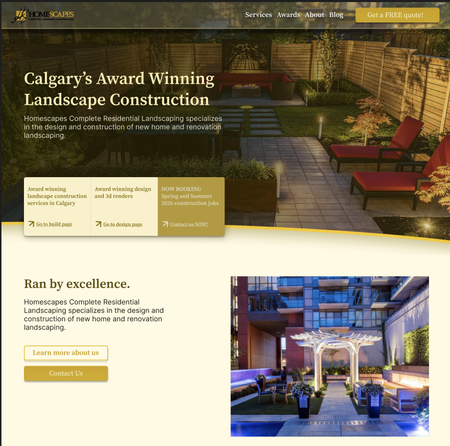
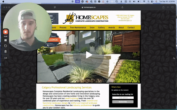
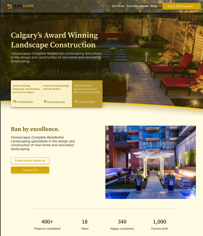
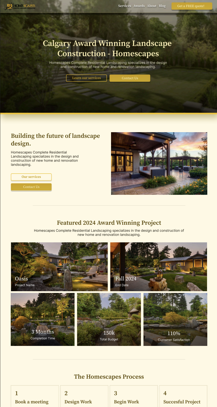
Home Page
The old home page looked professional but dated. Everything was centered, the layout felt narrow, and nothing guided the user anywhere. The call to action was unclear, the hero didn’t say what Homescapes actually does, and important trust markers were pushed to the bottom where most people wouldn’t see them.
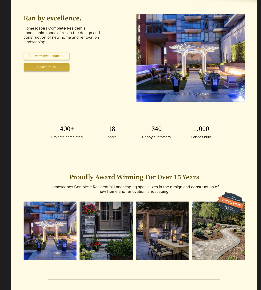
I rebuilt the page so the first thing users see is a clean, direct explanation of the services, paired with strong project imagery. this instantly sets the tone and raises trust. I added reviews and awards higher up on the page and simplified the call to action into one clear path. the new layout feels open, modern, and intentional, which creates a more premium first impression.
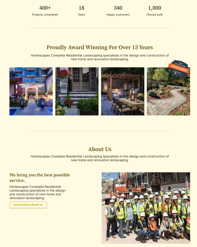
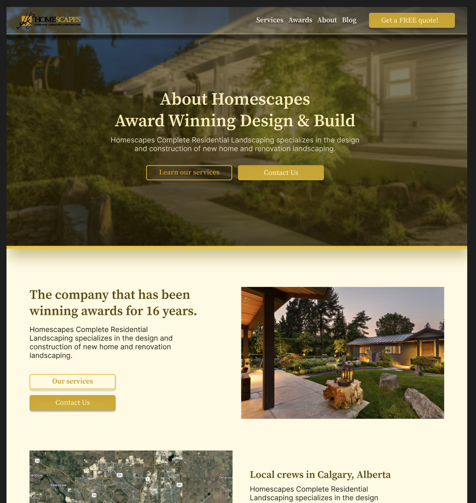
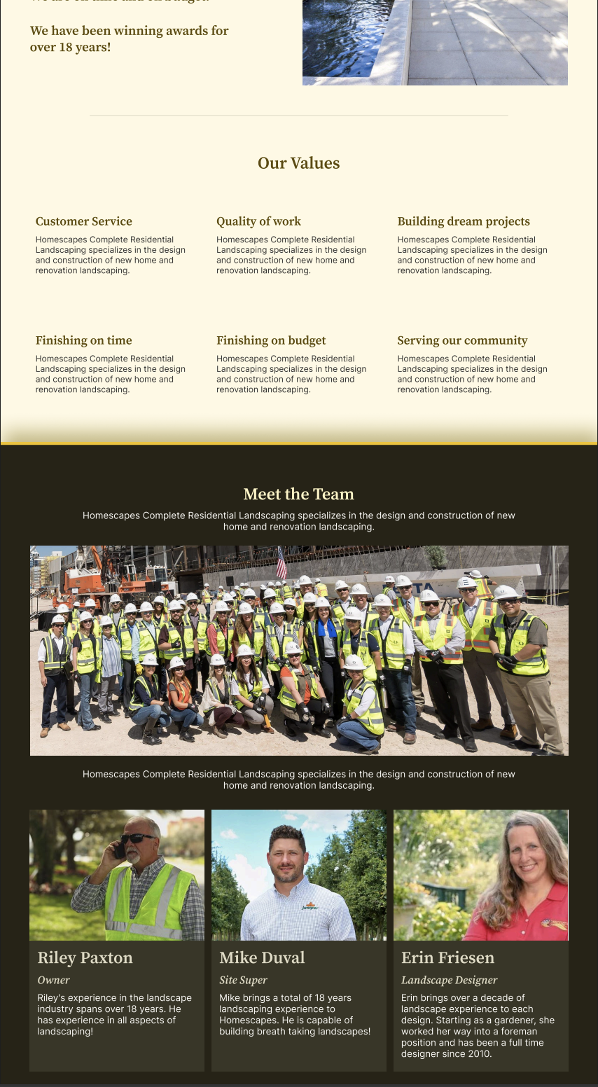
About Page
The original about section was confusing because most of the real information was hidden behind a small “more” link. Users had to click around just to understand who the company is.
I rewrote the page so everything is in one place and easy to read. the new version talks about the team, their experience, their ethics, and why they take pride in their work. I added a simple “why choose us” section and improved the hierarchy so the headings stand out.
This makes the company feel more trustworthy and eliminates the guesswork. For a high ticket service like construction, a strong about page plays a huge role in building confidence.


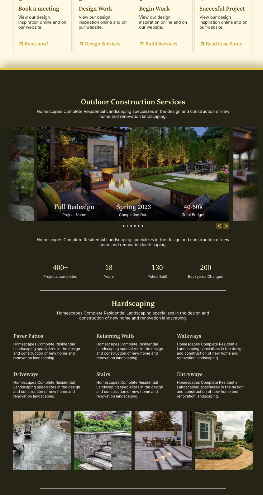
Service Page
The original Homescapes service pages were the weakest part of the entire site. In my critique I talked about how they felt more like a narrow blog layout than an actual breakdown of what the company does. Everything was centered, cramped, and buried in long paragraphs that didn’t say much. The writing sounded polished but didn’t list any real services, which is the number one thing customers are looking for. Instead of telling people whether they build patios or retaining walls or handle arbor work, the page focused on vague statements like “infusing beauty and value into design.” On top of that, the design and build pages had almost no images, meaning users had no visual proof of capability. for landscaping, that’s a huge issue. the gallery also wasn’t helping because the photos were tiny thumbnails that most people would skip over.
The redesign fixes all of that by rebuilding the page into clear, visual service categories. instead of abstract copy, each section actually explains what Homescapes offers in real terms: construction, stonework, woodwork, softscapes, arbor services, and seasonal work. I added strong, full width images throughout the page and brought in a before and after section to show transformations. these visuals are important because people trust what they can see, and landscaping is a visual industry. Big headings, open spacing, and better hierarchy make the content easy to skim, which is how users navigate service pages in the real world. The layout feels modern and structured instead of tight and text heavy, which instantly changes the perception of quality.
Finally, I pulled awards and certifications into the actual service flow instead of hiding them at the bottom. Social proof only works when people see it, and strong awards placed in the right spots can change how legitimate a business feels. Each section also has a simple call to action so users don’t have to scroll back up or hunt for a button.
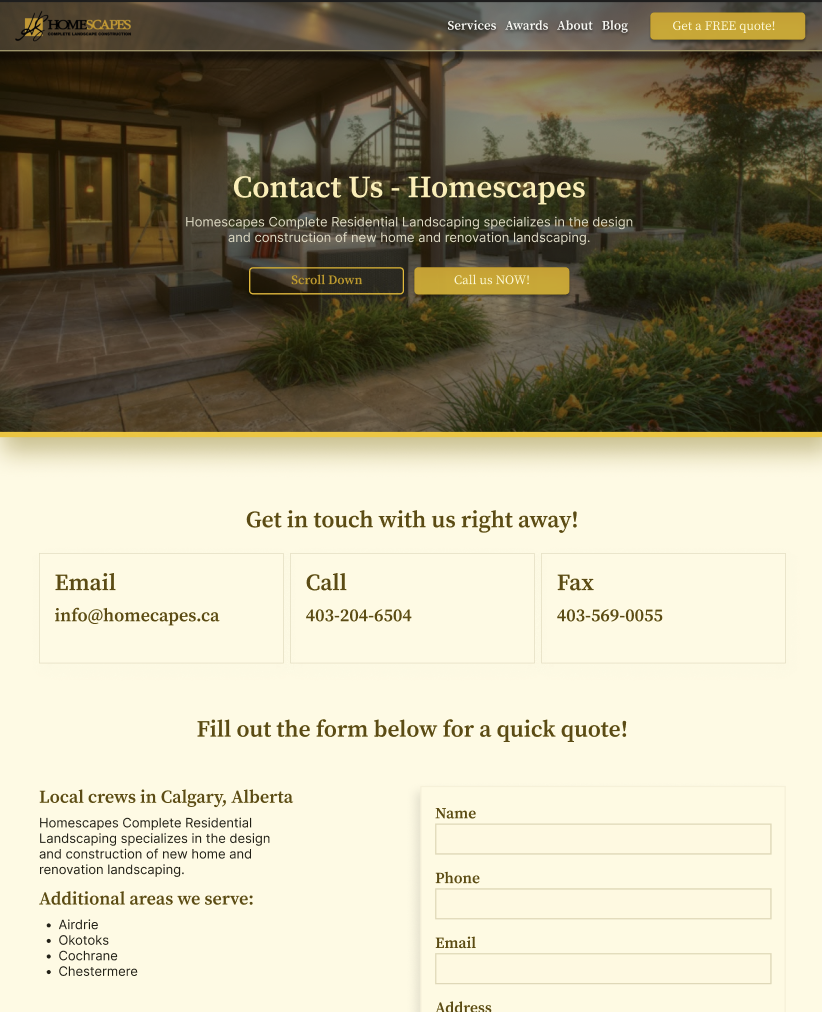
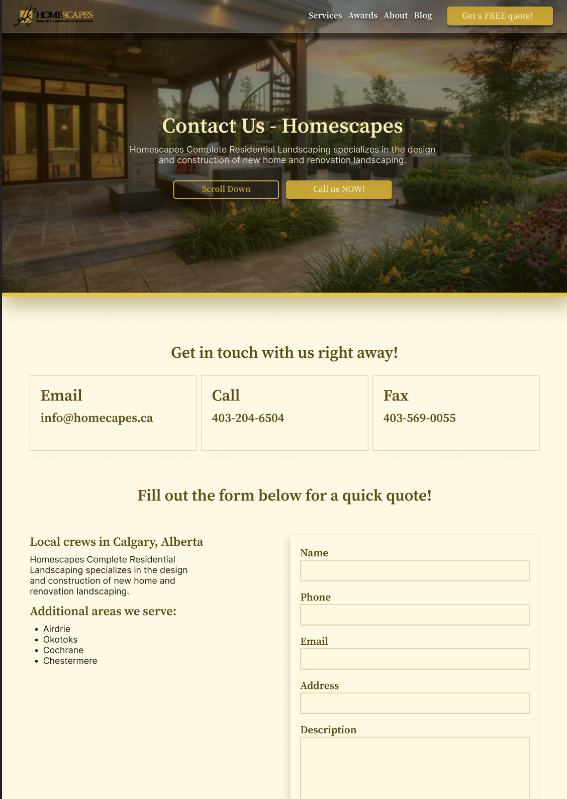
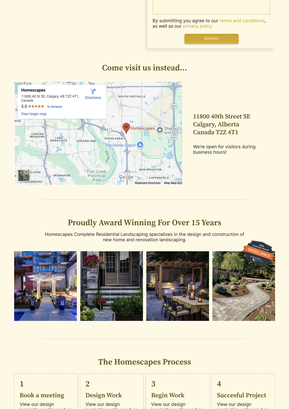
Contact Page
The old contact page had too many paths and made it unclear what the user was supposed to do. Different numbers, different buttons, different pages.
I simplified the entire experience. The new contact page has one clear call to action and a short, easy form with only the essential fields.
Beside the form I added small trust elements like service area and experience so the page feels safer to submit. The layout is clean with lots of white space so it doesn’t feel overwhelming. a simple, frictionless contact page directly increases the number of leads a business gets.
Did you enjoy reading this? Want to learn more or get in contact with me?
Send me a message!